

The fastest way to make a party invitation look homemade, in the wrong way, is to choose a pretty font that nobody can read. The best Canva fonts for party invitations balance personality, spacing, and print clarity, especially when the same design will be reused on chip bags, stickers, candy wrappers, and favor tags. At Hangingwiththekiddos, we design with real party printables in mind, so I always test fonts at invitation size and favor-label size before calling a pairing finished.
Canva font pairing: a Canva font pairing is a planned combination of two or three typefaces, usually one decorative display font, one readable headline font, and one simple body font, used to create a clear party design.
Table of Contents
What are the best Canva fonts for party invitations?
The best Canva fonts for party invitations are readable at small sizes, match the party theme, and pair well with simple supporting text. For most DIY party designs, use one statement font for the child's name, one clean font for details, and one accent font only if the layout still feels easy to scan.
Competitor lists often focus on weddings or general birthday fonts, but party invitations need to work harder. A birthday design may become a welcome sign, cupcake topper, water bottle label, and thank-you tag. That means the font has to survive resizing.
Quick font roles:
- Display font: the fun font used for names, ages, or big words like "Party."
- Body font: the clear font used for date, time, address, and RSVP details.
- Accent font: the optional script, handwritten, or playful font used sparingly.
Key insight: if the RSVP line looks crowded, the font pairing is not ready for print.
Research on digital communication keeps pointing back to clarity and audience fit. A 2025 resource by Neya Global and Anna Kazanskaia studied digital communication for organizations, which applies nicely to invitations: your design has one job, to help people understand the message quickly.
Fast-start Canva font pairing table
| Party style | Display font | Detail font | Best use |
|---|---|---|---|
| Cute birthday | Balabeloo | Poppins | Kids' invitations, favor tags |
| Luxury glam | The Seasons | Montserrat Light | Sweet sixteen, bridal showers |
| Retro party | Cooper Black | Josefin Sans | Roller skate, disco, 70s themes |
| Playful bold | Lilita One | Open Sans | Chip bags, candy wrappers |
| Girly script | Brittany | Libre Baskerville | Spa parties, princess themes |
| Classroom | Comic Neue | Nunito | Teacher tags, school celebrations |
| Modern minimal | Glacial Indifference | Lora | Adult birthdays, simple invites |
Which Canva font pairings fit each party style?
Canva font pairings work best when the font mood matches the theme before any colors, clipart, or photos are added. I like to choose fonts before decorations because type sets the whole tone of the invitation.
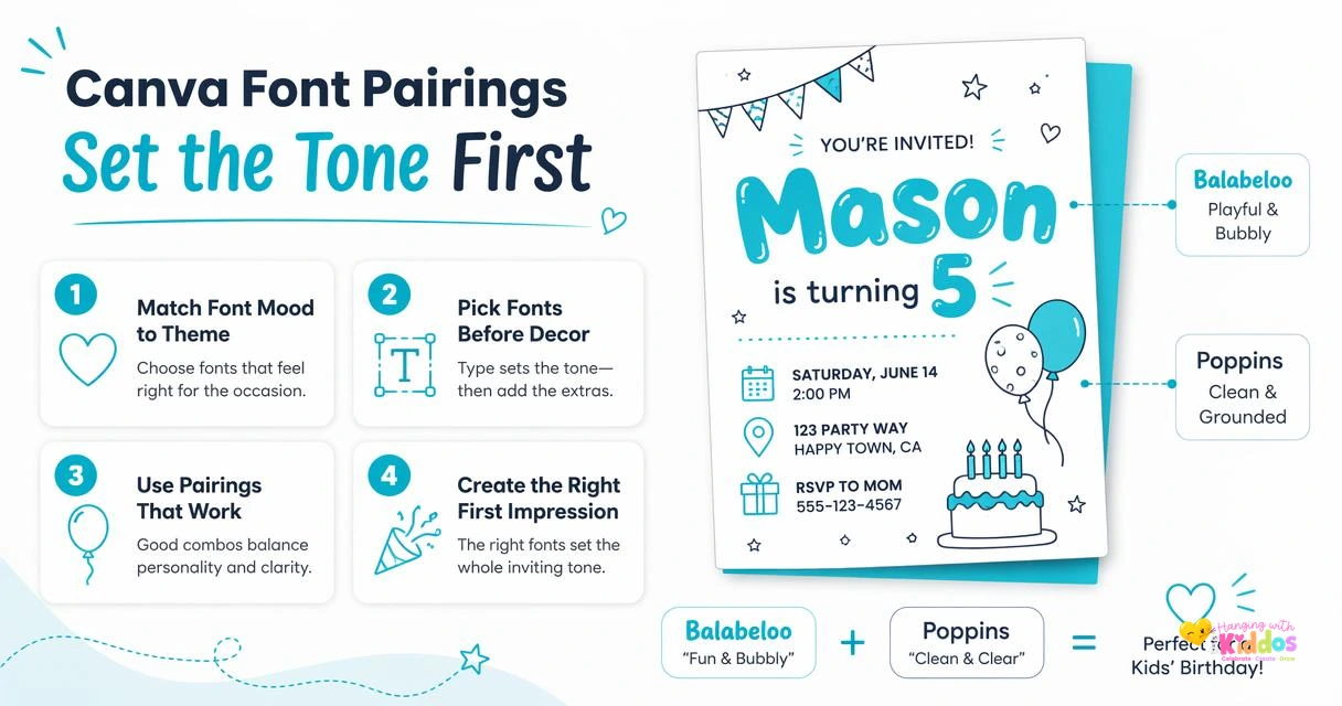
For a cute kids' birthday, try Balabeloo + Poppins. Balabeloo gives the bubbly party feeling, while Poppins keeps the address and RSVP information clean. This pairing also works well if you are customizing a free chip bag template for DIY favors in Canva because the headline stays bold on glossy paper.
For a luxury invitation, use The Seasons + Montserrat Light. The Seasons has an editorial, upscale look. Montserrat Light keeps the details modern without fighting the headline.
For a retro party, use Cooper Black + Josefin Sans. Cooper Black feels fun and vintage, while Josefin Sans keeps the invitation from looking too heavy.
For a girly script look, use Brittany + Libre Baskerville. Brittany is beautiful for names, but I would not use it for addresses or times. Libre Baskerville gives the design a polished finish.
For classroom celebrations, use Comic Neue + Nunito. Comic Neue feels friendly without being messy, and Nunito prints nicely on small tags, teacher gifts, and treat labels.
My favorite printable pairings:
- Lilita One + Open Sans for bold birthday favor tables.
- Brittany + Poppins for spa, Barbie-inspired, or bow themes.
- The Seasons + Montserrat for elegant adult parties.
- Balabeloo + Nunito for preschool and classroom parties.
- Cooper Black + Glacial Indifference for retro dessert tables.
Helpful Canva invitation tutorial
If you want to see invitation layout in action, this Canva tutorial is a useful visual reference:
The style is wedding-focused, but the same layout logic works for birthdays: headline first, details second, decoration last.
How do you choose readable fonts for printable party favors?
Choose readable fonts for printable party favors by testing the smallest text first, then checking spacing, color contrast, and paper finish. If a font only looks good zoomed in on your screen, it may not work on stickers, Capri Sun labels, candy wrappers, or favor boxes.
Small print is where many cute designs fall apart. A thin script may look lovely on an invitation but disappear on glossy sticker paper. A chunky font may look fun on a chip bag but crowd the nutrition-style panel or thank-you note.
For favor labels and wrappers, I recommend keeping decorative fonts above 18 pt when possible. Use simple fonts like Poppins, Nunito, Open Sans, Montserrat, or Lora for the fine details.
Print-readability checklist:
- Print one test page before making the full batch.
- View the design from arm's length, not just close up.
- Use dark text on light backgrounds for details.
- Avoid all-caps script fonts for addresses or RSVP lines.
- Leave extra space around names, dates, and labels.
Party & Confetti® Glossy Cardstock is a smart match for invitations because it gives colors a polished look while still feeling sturdy. For labels, Party & Confetti® Waterproof Glossy Sticker Paper helps designs look bright and clean on bottles, treat bags, and favor containers.
A 2022 study by Adam Mudinillah, Amrina Amrina, and Muhammad Abdul Hamid examined Canva as a learning media tool. For party creators, the practical takeaway is simple: Canva is approachable, but the designer still has to make clear choices.
What font mistakes make invitations look less polished?
Font mistakes make invitations look less polished when they reduce readability, create visual clutter, or clash with the party theme. The most common problems are using too many fonts, picking scripts for tiny details, and choosing type that does not match the printable item.
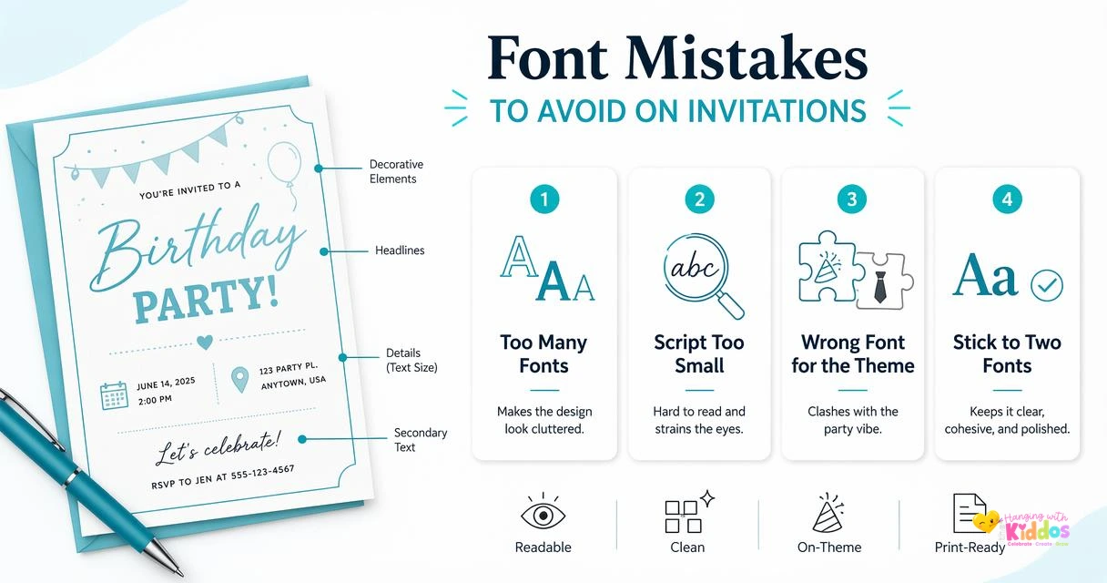
I usually cap each invitation at two fonts, three only when the third font has a very specific job. Too many decorative fonts can make a design feel busy, especially when you add characters, balloons, confetti, or themed clipart.
Avoid using super-thin fonts over patterned backgrounds. Thin type can vanish after printing, especially on busy designs. Also avoid stretching fonts wider or taller in Canva because it can make the letters look distorted.
Common mistakes to fix before printing:
- Using a script font for the full invitation body.
- Mixing two decorative fonts that compete with each other.
- Placing pale text on pastel backgrounds.
- Forgetting to test the design at actual print size.
- Choosing fonts that do not fit the theme age group.
If you are making treat table items, test the font on the smallest piece first. For example, a candy wrapper has less room than an invitation, so your detail font matters more. Our DIY Skittles candy wrappers guide is a good next project if you want to practice scaling names and short messages.
A font can be beautiful and still be the wrong choice if guests cannot read the date, time, or location.
How should Canva fonts be used across invitations, tags, and labels?
Canva fonts should be used consistently across invitations, tags, and labels so the whole party table feels coordinated. Use the invitation font pairing as your style guide, then adjust size and weight for each printable piece.
Start with the invitation because it has the most information. Then reuse the headline font for names, ages, and short phrases on other items. Keep the detail font the same across water bottle labels, favor stickers, and thank-you tags.
For small business sellers, this consistency also makes templates easier for customers to edit. Research by Jiyoon Jung, Jieun You, and Daesang Kim in 2025 looked at digital literacy programs for older adults, a useful reminder that editable designs should be clear and friendly for people with different comfort levels online.
Hangingwiththekiddos designs are made for real DIY party setups, not just pretty screenshots. When pairing fonts with Party & Confetti® Printable Party Supplies, I look for fonts that stay sharp on glossy chip bag paper, sticker paper, and cardstock.
For school events, keep the tone cheerful and easy to read. A teacher thank-you gift tag printable is a great place to use Comic Neue, Nunito, or Poppins because those fonts feel warm without becoming hard to read.
Simple Canva setup process:
- Pick one display font for the party name or child's name.
- Pick one plain font for event details.
- Create the invitation first.
- Resize the same style for tags and labels.
- Print one sample on the paper you plan to use.
- Save a Canva brand-style page for future parties.
For more printable party ideas and supplies, visit hangingwiththekiddos.com before you start your next design batch.
FAQ: Canva fonts for party invitations
What is the easiest Canva font pairing for beginners?
The easiest Canva font pairing for beginners is Poppins + a decorative display font like Balabeloo, Lilita One, Brittany, or The Seasons. Poppins is clean, modern, and readable, so it works well for dates, times, addresses, and RSVP lines while the decorative font adds personality.
Are free Canva fonts good enough for party invitations?
Free Canva fonts can be good enough for party invitations if you choose readable styles and test print before making copies. Many strong options, including Poppins, Open Sans, Nunito, and Josefin Sans, work well for DIY printables. Canva Pro gives more choices, but good design choices matter more than having more fonts.
What Canva fonts work best for small favor labels?
The best Canva fonts for small favor labels are simple sans serif fonts such as Poppins, Nunito, Open Sans, Montserrat, and Glacial Indifference. Use decorative fonts only for short names or words. Small labels need stronger contrast, slightly larger spacing, and fewer flourishes than full-size invitations.
Can I use the same fonts for invitations and chip bags?
Yes, you can use the same fonts for invitations and chip bags, but adjust the hierarchy. Use the invitation's display font for the name or age on the chip bag, then use the clean detail font for smaller text. Party & Confetti® Glossy Chip Bag Paper helps bold fonts and bright colors print with a polished finish.
Conclusion
The best Canva fonts for party invitations are the ones that look cute, print clearly, and still work when your design becomes a favor tag, wrapper, label, or classroom treat. Start with one of the pairings above, print a small test, then build the rest of your party set from that same font style.
My recommended next step: choose your party style, make one Canva invitation, then test the smallest matching printable before printing the full set. If you want more DIY party help, head to hangingwiththekiddos.com and browse Hangingwiththekiddos for printable ideas that pair beautifully with Party & Confetti® papers.